
Zen fits everywhere in your every day life. Philip, the owner of ZenChest wants to bring luxury, handcrafted products to your doorstep to bring that extra detailed feeling to your daily rituals.
In this project Simon & his two colleagues working as interns at the consultancy company BlueHands Digital got to conduct UX-analyses of ZenChests webstore to increase conversions and create trust with their users.
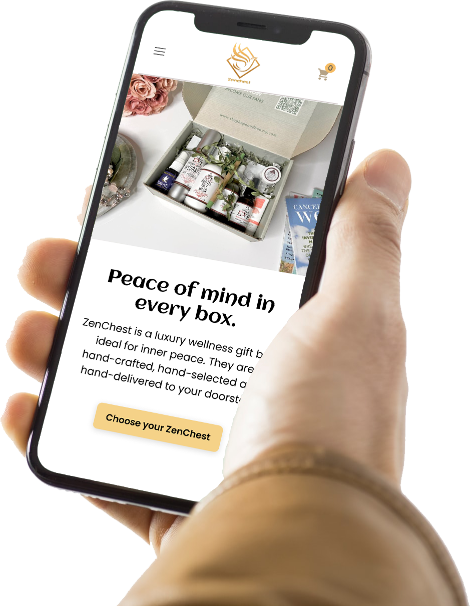
Simons role included: UX-research, Mobile UI, Ideation, Workshops, User journey creation, Interviews, A/B testing, Hypothesis statements
This short summer internship project together with Zenchest was focused on improving the functionality and giving clarity to the users.
Philip, the owner of the website expressed that something was missing. The company was relatively new and frequent users weren’t many at all. The website started as a side-project but was now looking to expand. Philip needed Simon’s team’s help him with bringing a quality experience to ZenChests users. Simon’s team iterated and reflected which lead to the delivery of a visual protoype together with research data.
How could the UX-designers create trust and clarity for the users of ZenChest, aswell as help them fulfill their tasks?
The purpose of Zenchest is for users to be able to easily order seasonal wellness packages delivered to their doorsteps. Zenchest offers one new Zen package per season. One for summer, one for winter, one for spring etc. One package can contain items such as a pillow sprays, massage oils, candles, teas, small decorative details or even chocolate.
With that said, they offer 1 product to sell. But the containing items of that product change as the year passes.
ZenChests main users are mainly women, but also some men, between the ages of 18-65.
A bigger majority, 80% of the users live in Sweden and 75% of them use a mobile phone to browse the website.

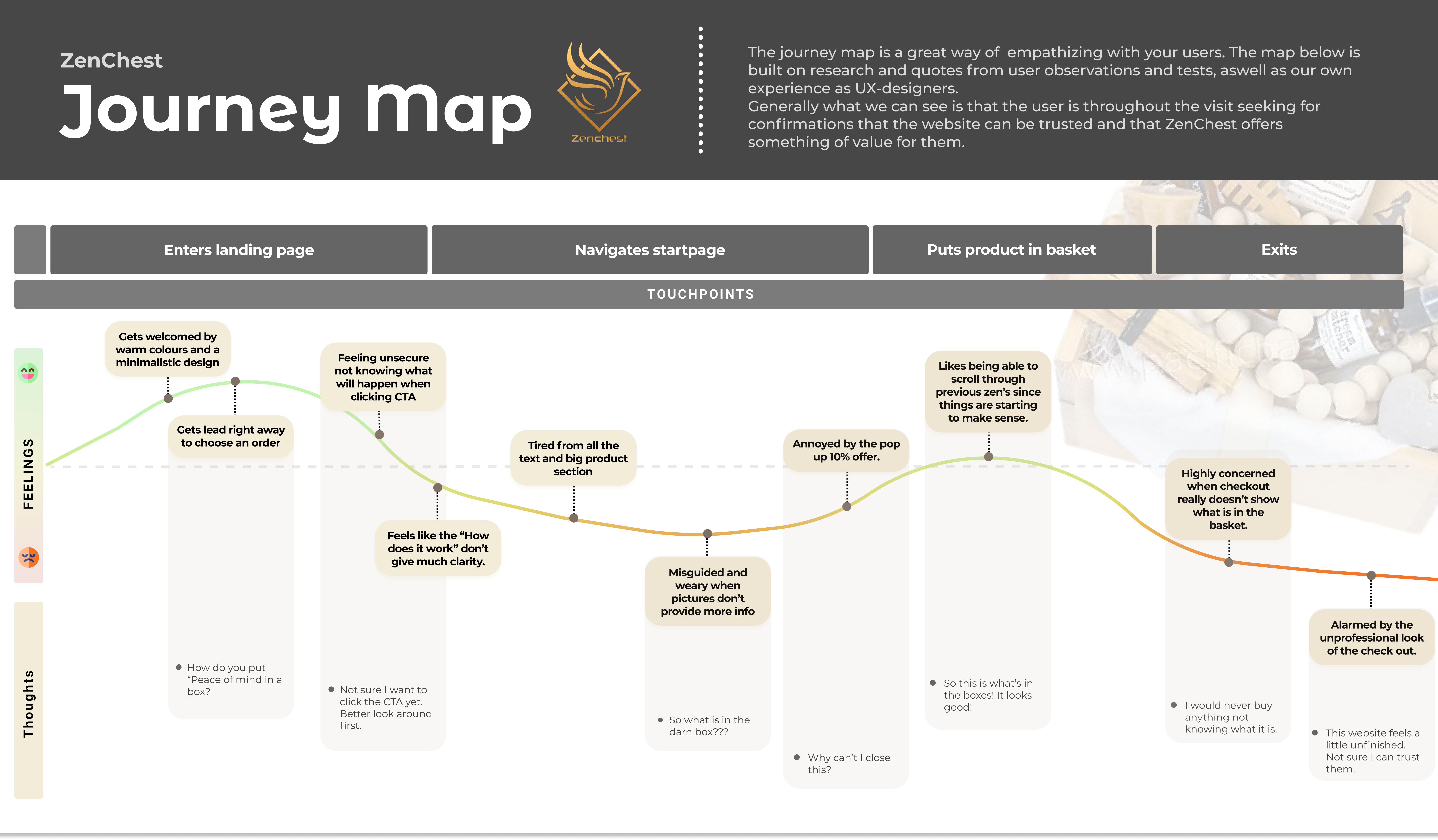
The UX-team sat down together and as often, they decided they had to create more empathy with the users. This was done through simple expert reviews and target user tests/interviews.
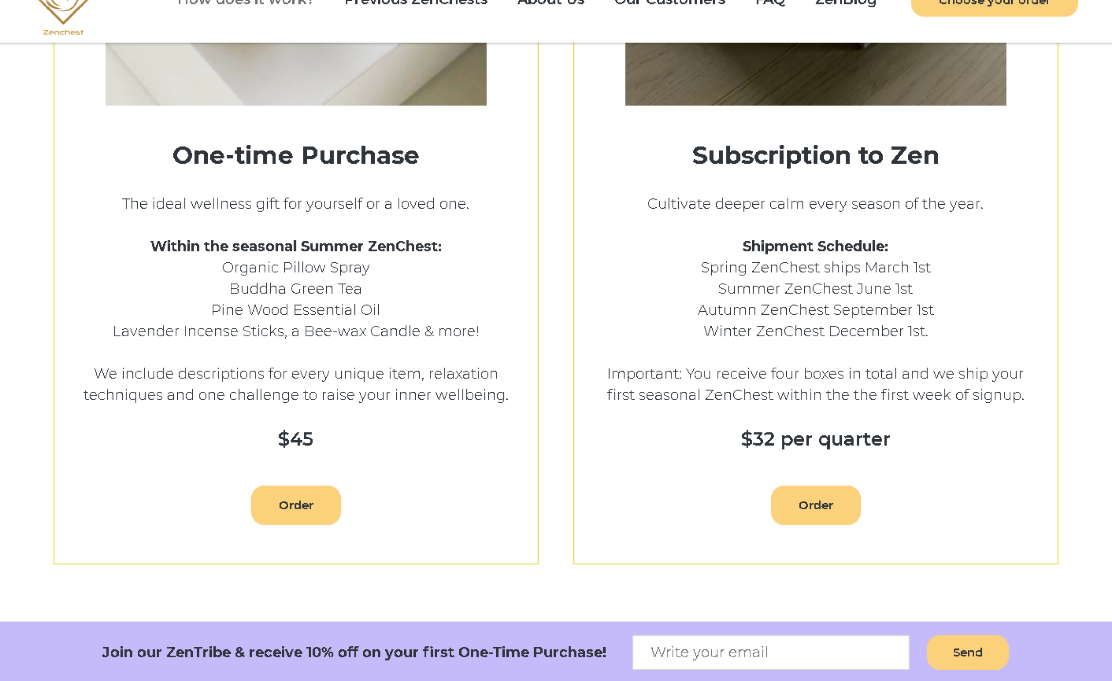
The expert review that was done in just a few hours helped the team realise that some of the most critical problems with the website were:
From interviews with target audience groups this was also confirmed. First time users thought the website had nice colours and looked welcoming, but they had no idéa of what they were buying. “I think they’re selling parfume” was one of the quotes the team got from an interviewee that had been studying the website for a few minutes.
Simon and the team could pretty straight away tell that one thing that contributes to these problems are the missused pictures, and sometimes a confusing language.
The checkout itself was also a problem, but the team assumed not many people would reach the checkout if no clarifications were given earlier.
“With expert reviews and external interviews in mind, the main focus in coming design suggestions will be about trust, transparency and clarity for the user.
The team of UX-designers have analysed the need of a more transparent communication and guidance for the user to be intrigued and interested to sign up for a seasonal subscription.
This can be tested through creating design suggestions and running A/B tests aswell as qualitative interviews around the users experiences.”
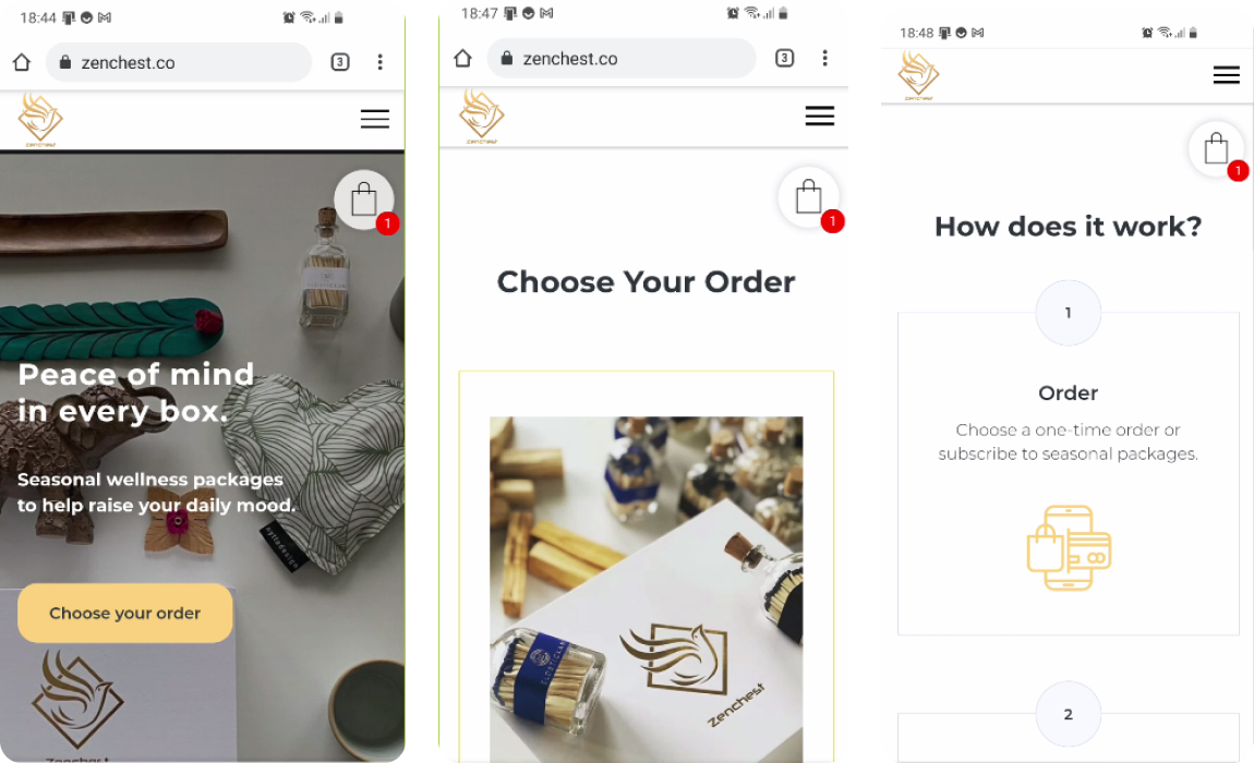
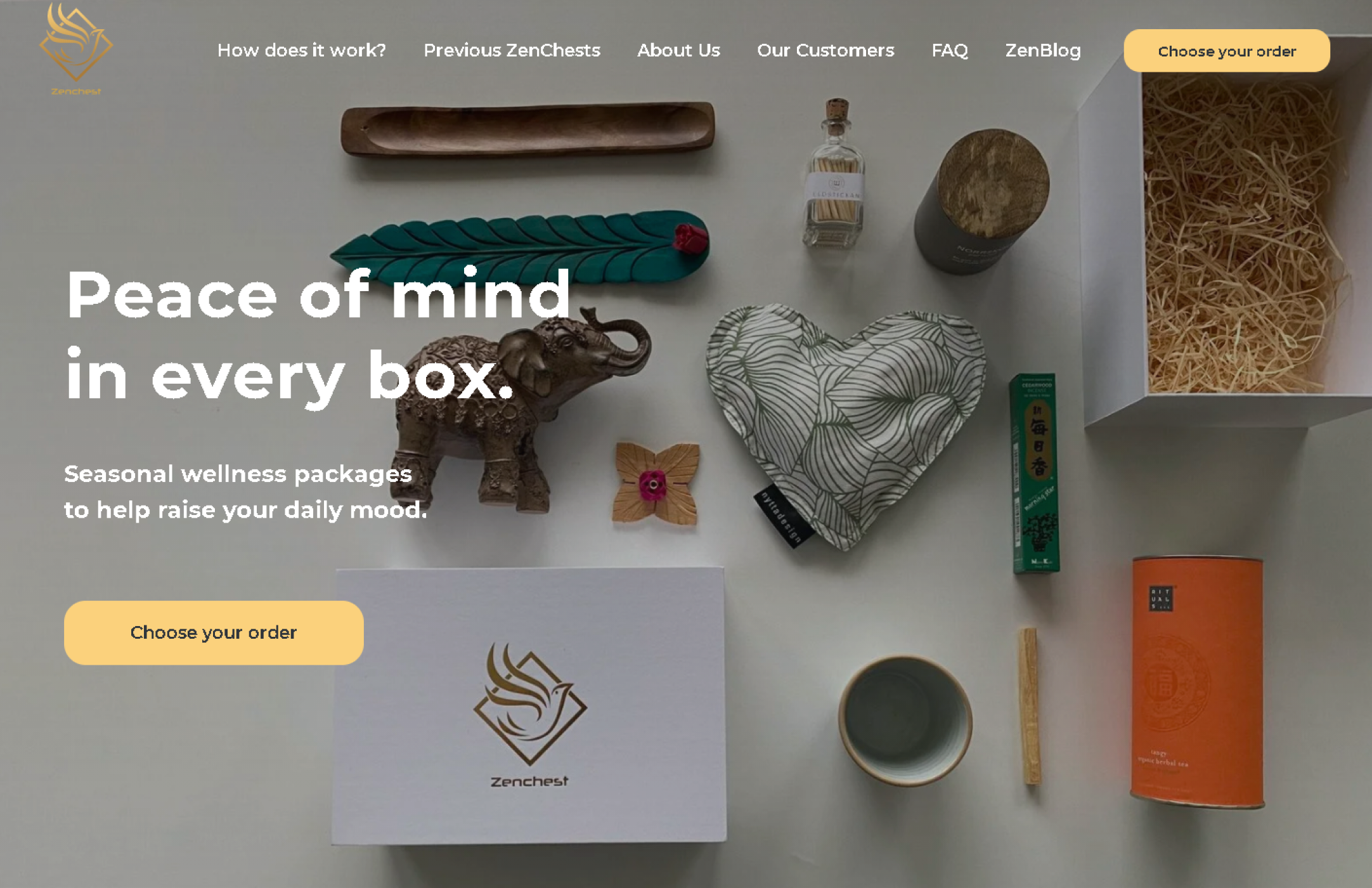
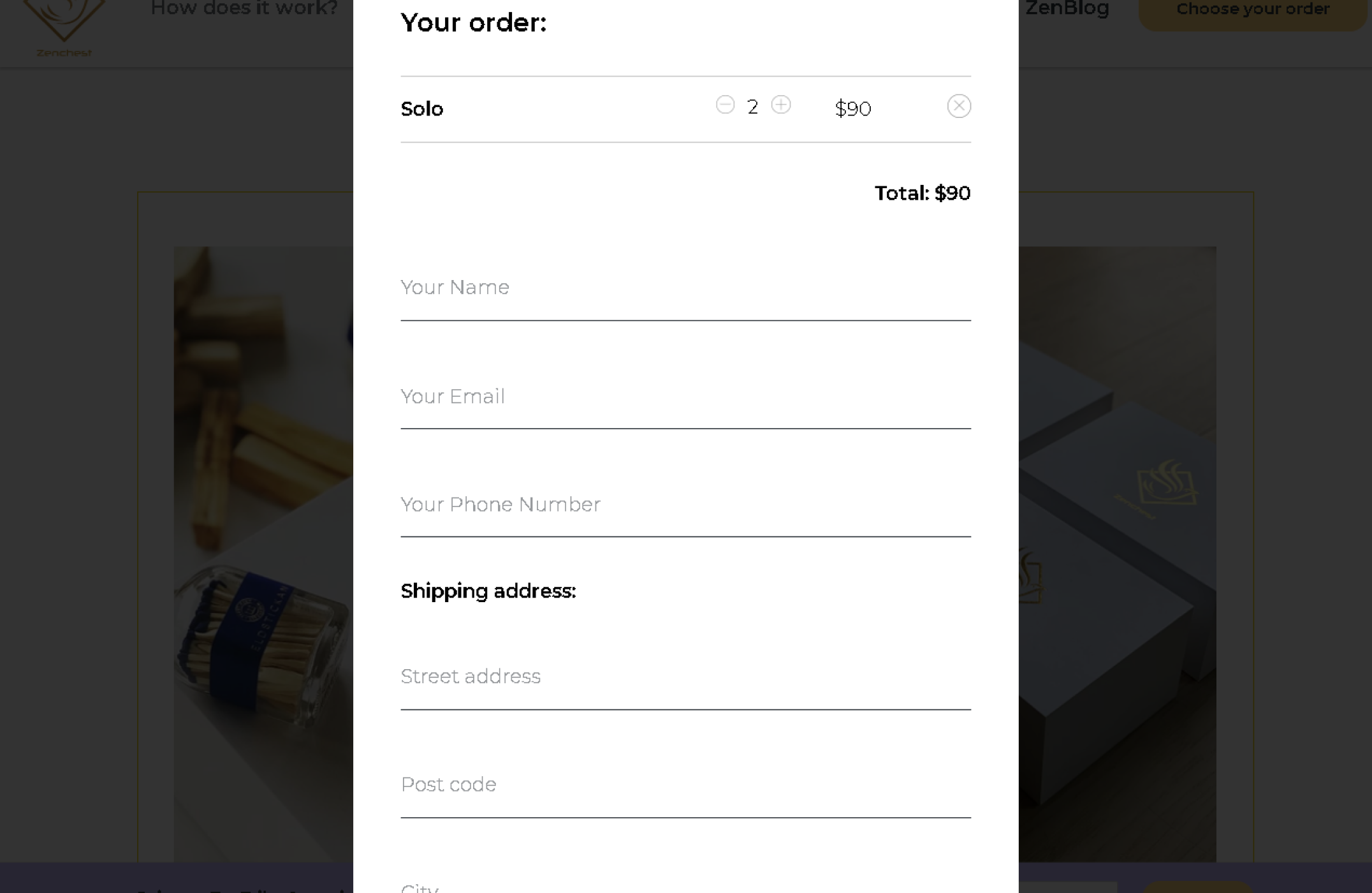
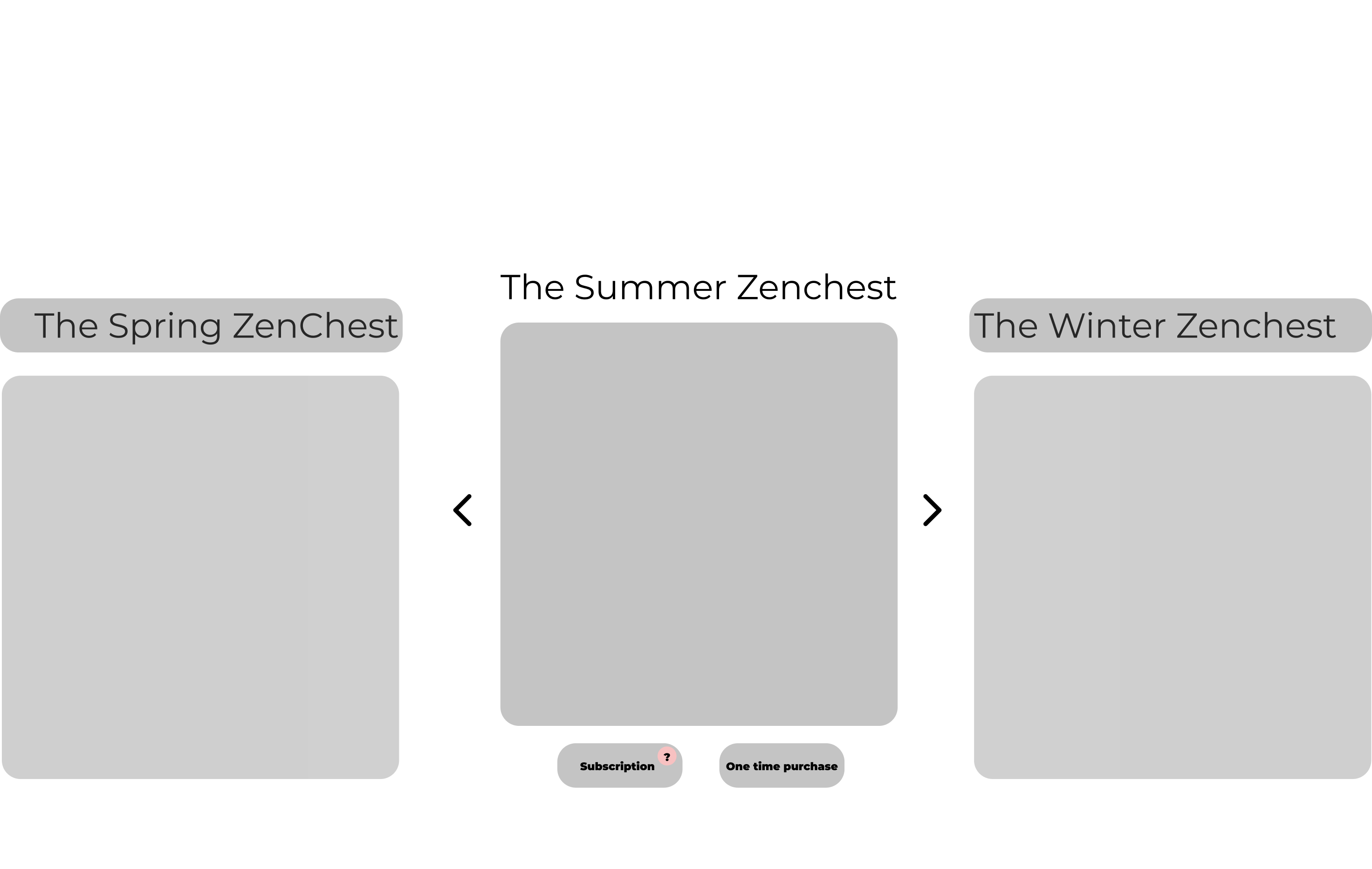
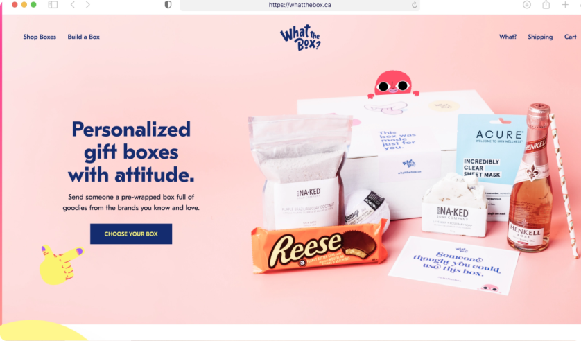
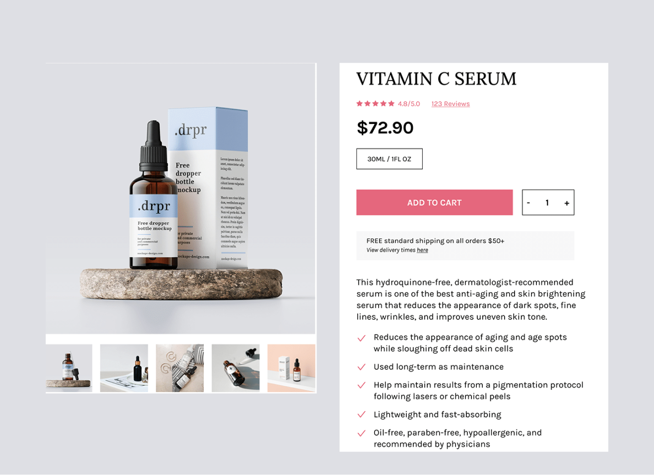
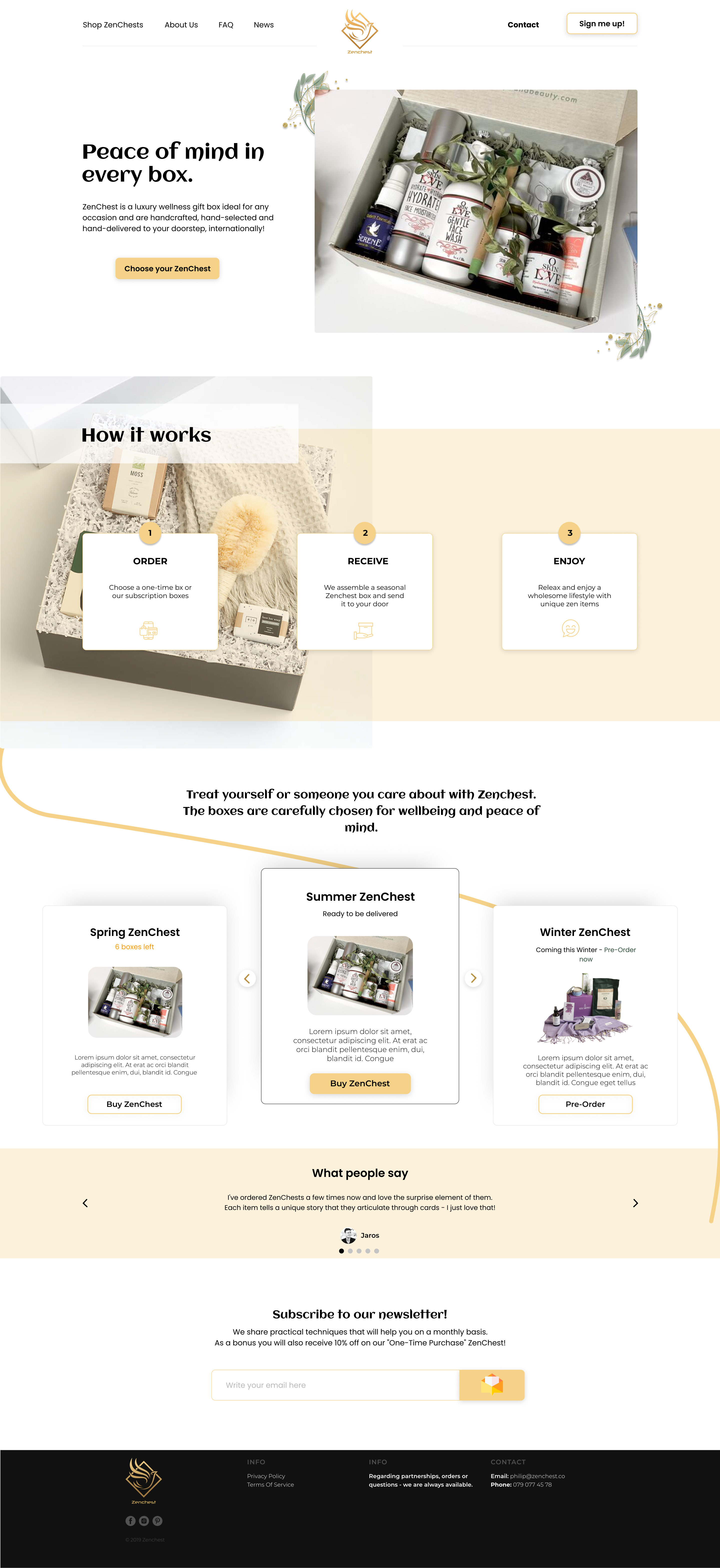

Simons team brought their proposed solutions into AB testing to validate if their prototypes would solve any of the users needs and to learn more of the users to ZenChest. From these testings and interviews it was validated that people understood better what the website offered and most participants understood the previously confusing concept of seasonal packages. But to some, it was still a little unclear at first. A question for the future could therefore be; “How might we make it even more obvious how the seasonal concept works?
Below are some of the quotes we got from testing the prototypes. The names are exchanged with aliases.
Website number 1 is below referred as the current/old version of the website and website number 2 is Simon's teams solutions. The participants did not know which was which and had not used ZenChest before, but fitted the target audience.
- If you were to compare the two websites, what would you say?
"Website number 2 (proposed solutions) was alot clearer, it was easier to find what you wanted and more attractive because I could understand what it was about. I got information quickly."
"This website is more direct and clear. It guides me better and I really like the product description.
It gives a true value of the business idea and what the products are about. I didn't really like the pictures though.
"I definitely liked website number 2 more. Because it felt clearer to me and I got a better appreciation of the different alternatives and proposals for products."
"Number 2 gave me a better understanding of the products, a better overview and I can see the chart and I understand that the products are boxes with wellbeing products."
Simon's role in this project was agile. He prepared the research, designed the mobile UI and the user journey but was also part of the early ideation and problem definement processes.
If Simon's team would get to continue working with ZenChest they would focus on looking at how the conversions and metrics changed after the website had implemented the changes they proposed.
blablabal
After the user tests were concluded Simon’s team presented their work to their client. The reactions were positive and it was expressed that the message really had gone through, that ZenChest needs to work more with creating trust and clarity for the users.
To keep in mind is that this company is still considered as a start-up and is not really established on the market yet. This means that even small changes might take both a lot of time and resources for the client to implement. Yet it’s always important to keep the users needs first and will always be the key for a start-up to get stable and create revenue. In other projects Simon's been in, there has been fear of making big changes in start-ups due to costs and resources. But what's the point of creating a business made for the user, if you don't want to adapt for their needs? Luckily this was not the case with ZenChest, they seemed both enthusiastic and aware of the importance of a good user experience. Hopefully our project contributed to that Zenchest will gain traction and be known by a larger audience in the future.